
A blank wall in a business rarely stays blank by accident. It often becomes a missed chance to direct visitors, reinforce a team’s purpose, or make a workspace feel intentional. This custom business signage guide can help you choose wall messaging that looks polished without committing to paint, permanent fixtures, or a complicated installation process.
For offices, schools, churches, salons, retail spaces, and service businesses, the right sign does more than fill open space. It answers questions before someone has to ask them. It gives employees and visitors visual cues. It also makes a brand feel more consistent from the front door to the back hallway.
Start With the Job Your Sign Needs to Do
Business signage works best when every piece has a clear purpose. Before selecting colors, fonts, or dimensions, decide what the sign should accomplish in that specific location.
Wayfinding signs help people move through a building confidently. Restroom lettering, room labels, check-in directions, exit reminders, and office names are practical examples. These signs should be easy to read at a glance, especially from a short distance or while walking.
Branding signs create a stronger first impression. A company logo in the reception area, a tagline behind a front desk, or a mission statement in a meeting room helps visitors understand who they are doing business with. In a school or church setting, a wall decal can also reinforce shared values, a scripture verse, or a message of welcome.
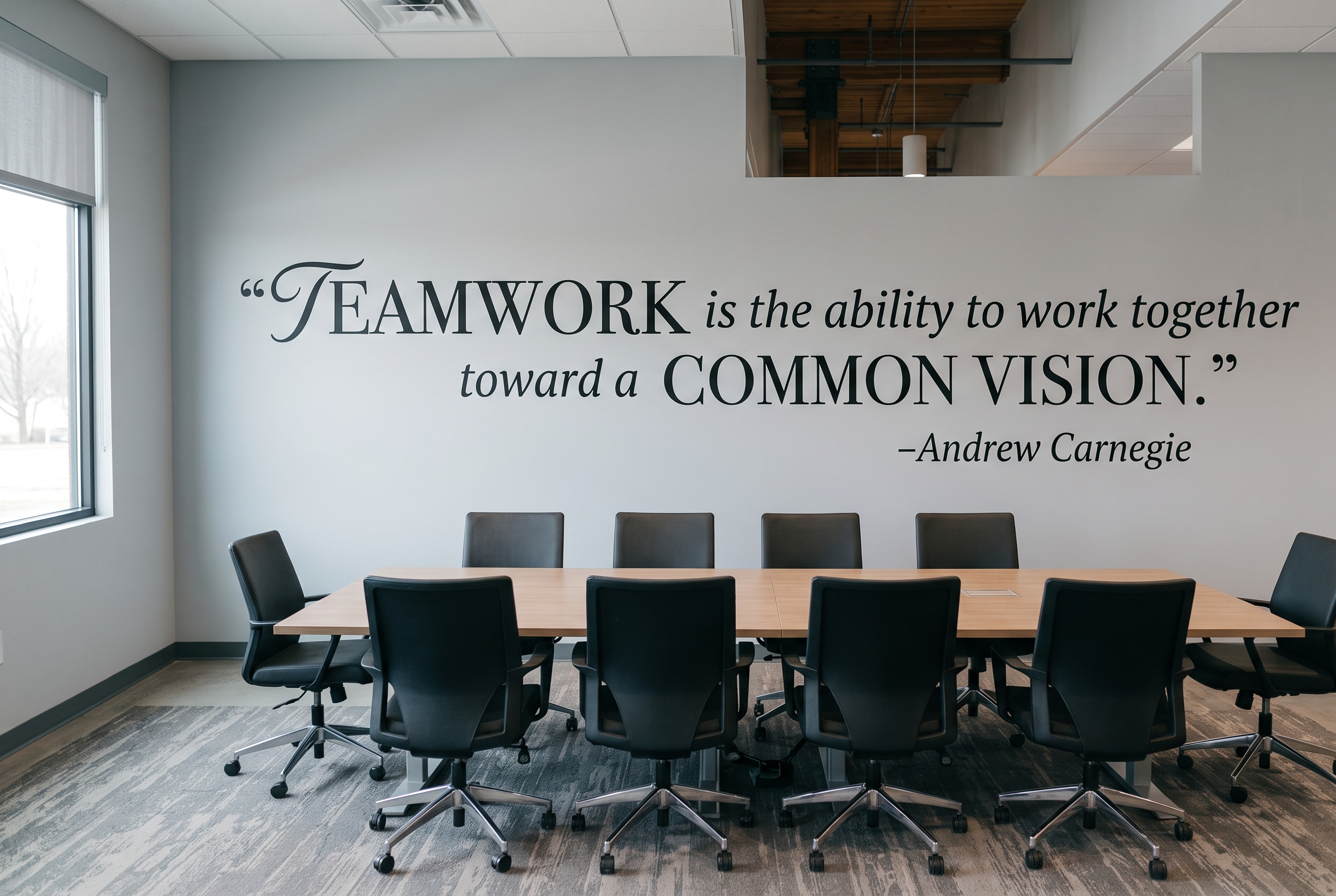
Culture-focused signage is designed for the people who use the space every day. Think of motivational quotes in a staff room, behavior expectations in a classroom, safety reminders in a production area, or a statement of purpose in an office. These messages should feel genuine. A phrase that sounds like your organization will have more impact than a generic quote placed on the wall because it looked nice online.
One wall can serve more than one purpose, but trying to make it do everything usually creates clutter. A reception wall may need a logo and short tagline. A hallway may need directional lettering. A break room may be the better home for a longer, encouraging message.
Choose Custom Business Signage That Fits the Space
A good design on the wrong wall can still underperform. Measure the usable wall area, then consider the viewing distance, furniture placement, lighting, and existing décor. A small decal can get lost behind a reception desk, while oversized lettering may overwhelm a narrow hallway.
Start with the wall itself. Smooth, clean, dry painted walls are generally the best surface for vinyl lettering and decals. Fresh paint needs adequate curing time before installation, and highly textured surfaces can affect how cleanly the vinyl adheres. If the wall has brick, heavy texture, peeling paint, or a glossy finish, pause before ordering. The material may still work in some cases, but the application method and expected result can be different.
Viewing distance matters just as much as wall dimensions. A sign meant to be read from a doorway needs larger lettering than a message read from a few feet away in a conference room. For a lobby logo, step back and view the wall from the entrance. For room labels, stand where a visitor would naturally look for directions.
Color should support readability first and style second. High contrast is easier to read, particularly for directional and informational signs. Dark lettering on a light wall or light lettering on a dark wall is usually a dependable choice. A subtle tone-on-tone logo can look sophisticated in a reception area, but it may not be the best option when visitors need quick guidance.
Keep Branding Consistent Without Making It Feel Corporate
Custom signage should look like it belongs in your business, not like it was added after everything else was finished. Use your existing logo colors and brand fonts where possible, but leave room for the wall, the lighting, and the scale of the room to influence the final design.
For example, a detailed logo that looks sharp on a website may need to be simplified for wall application. Small lines, tiny type, and intricate artwork can lose clarity when enlarged or viewed from across a room. A design consultation can help determine whether the full logo, an icon, a wordmark, or a simplified variation will look best in vinyl.
The same principle applies to messaging. A mission statement may be meaningful, but it can become difficult to read if every word is placed on one wall in the same size. Break longer copy into intentional lines, use hierarchy, and let the key phrase stand out. A short headline in larger lettering with supporting text beneath it often feels more approachable than a dense block of words.
Why Removable Vinyl Makes Sense for Many Businesses
Painted wall graphics can be beautiful, but they require more planning, more labor, and more permanence. A removable vinyl wall decal gives businesses a clean, hand-painted look while making future updates far less disruptive.
That flexibility is useful when a business changes locations, refreshes its logo, adds services, reorganizes rooms, or updates a seasonal display. Schools may need to revise classroom directions or messaging. Churches may want new messages for a ministry area. Offices may update values after a company-wide initiative. In these situations, removable signage can protect both the wall and the budget.
Matte-finish vinyl is particularly effective for interior wall messaging because it reduces glare and creates a painted-on appearance. When applied carefully, it does not have the shiny, temporary look people sometimes associate with stickers. It is a practical option for spaces that need to look established and professional without creating a permanent installation.
Removability does not mean the sign is flimsy. Quality vinyl is designed to stay in place under normal indoor conditions while still allowing for clean removal when the time comes. Results depend on the wall surface, paint quality, installation, and how long the decal remains in place, so it is wise to consider those factors before choosing any wall graphic.
Plan the Installation Before the Decal Arrives
A little preparation makes a noticeable difference. Clean the wall with a mild, residue-free cleaner, then let it dry completely. Avoid applying decals over dust, grease, moisture, or recently painted surfaces. Even the best material needs a clean surface to perform well.
Before removing the backing, use painter’s tape to position the design on the wall. This lets you check centering, height, and spacing without committing too early. For a logo behind a desk, compare the placement to the desk rather than the wall alone. For a hallway sign, check it against door frames, light switches, and other architectural details.
Large graphics are easier to install with two people. One person can hold and guide the material while the other applies it gradually. Take your time with transfer tape and work from the center outward to reduce bubbles. Rushing is one of the most common reasons a simple project becomes frustrating.
If the design includes several separate elements, keep the layout instructions nearby and apply the main piece first. That anchor makes it easier to place smaller words, icons, or decorative accents in the right position.
Common Signage Mistakes to Avoid
The first mistake is treating every wall as an advertising opportunity. Signs are more effective when there is visual breathing room around them. Open space helps a message feel deliberate and easier to absorb.
The second is choosing a message that is too long for the location. A lobby visitor has a few seconds to notice a sign. A concise welcome message or logo will usually work better there than a full paragraph about company history. Save detailed information for places where people naturally pause, such as waiting areas, training rooms, or employee spaces.
The third is ignoring future changes. If your sign includes staff names, temporary service offerings, changing room assignments, or a campaign-specific message, consider whether a removable decal is the more practical choice. You can keep the core branded elements consistent while updating the pieces that are likely to change.
Finally, do not underestimate the value of a proof. Seeing your logo, wording, and dimensions before production can prevent a costly mismatch between what you imagined and what fits the wall. The Simple Stencil offers custom decal design support to help businesses move from an idea or logo file to a wall-ready design.
Make the Wall Work Harder for Your Business
The most effective business signage feels useful first and memorable second. It gives people confidence about where to go, what to do, and what your organization stands for. When the material, scale, and message are chosen with care, a simple wall decal can make a workplace feel clearer, warmer, and more complete.
When you are ready to turn your logo, mission statement, directions, or room labels into a polished wall display, request a custom design consultation and begin with the wall your visitors see first.












Leave A Comment
You must be logged in to post a comment.