
A cafeteria can go from calm to congested in the few minutes between one lunch period and the next. Students are trying to find the correct line, choose a meal, locate utensils, return trays, and sit down before time runs out. Effective school cafeteria wayfinding gives them clear visual cues at each decision point, reducing hesitation and helping staff keep the room moving.
This is not about covering every wall with signs. It is about placing the right message where students need it, in language and visuals they can understand quickly. When directions are consistent, welcoming, and easy to spot, the cafeteria feels more organized for students, staff, and visitors alike.
Why Cafeteria Flow Affects the Whole School Day
Lunch is one of the busiest shared experiences in a school building. A small bottleneck at the entrance or serving line can create a ripple effect: students lose eating time, staff repeat the same instructions, and transitions back to class become rushed.
Clear wayfinding gives students more independence. Instead of asking, “Where do I go?” or following the crowd into the wrong line, they can see where breakfast pickup, hot lunch, salad, milk, condiments, seating, and tray return are located. That matters especially for younger students, new enrollees, visiting families, and anyone who benefits from visual structure.
A well-planned system also supports a more welcoming environment. Cafeterias can feel loud and overwhelming, particularly during peak periods. Friendly visual prompts reduce the amount of verbal correction needed from adults. The result is a space that feels more predictable without feeling overly rigid.
Start School Cafeteria Wayfinding at Decision Points
The best signage plan follows the student journey. Walk through the cafeteria as a student would, beginning at the door. Notice each moment where someone may pause, look around, or make the wrong turn. Those are the places that need visual direction.
At the entrance, a simple message such as “Start Here” or “Choose Your Lunch Line” can establish order immediately. If your school has separate lines for different meals, label them in large, high-contrast lettering. A student should be able to understand the choice from several feet away, not only after reaching the front of the line.
Inside the serving area, identify the next step rather than relying on students to infer it. Signs for “Entrées,” “Fruit & Vegetables,” “Milk,” and “Utensils” help students move forward with fewer pauses. In schools where students select meals from multiple stations, directional arrows can clarify the route and prevent students from backtracking through traffic.
At the end of the meal period, tray return signage deserves just as much attention. A clearly marked return area can prevent backup near tables and reduce spills. Pairing a short instruction with an arrow or simple icon often works better than a long list of rules.
Use Fewer Words and Stronger Visual Cues
Students do not have time to read paragraphs while holding a lunch tray. Cafeteria wayfinding should be brief, direct, and visible. “Line Up Here,” “Pick Up Milk,” and “Tray Return” communicate more quickly than formal sentences.
Large lettering, clean contrast, and consistent colors make a major difference. For example, a school may use one color for food stations, another for cleanup areas, and a third for seating zones. The specific colors matter less than using them consistently. Once students learn the visual pattern, they can navigate faster.
Icons can be helpful, particularly in elementary schools or multilingual communities. A milk carton, fork, recycling symbol, or tray graphic can reinforce the written message. Still, icons should support the words rather than replace them entirely. Some images are interpreted differently, while clear labels leave less room for confusion.
Avoid squeezing too much information into one sign. A menu board has a different job than a directional decal. Wayfinding should answer one question at a time: Where do I start? Which line do I use? Where do I sit? Where do I put my tray?
Choose Locations That Work at Student Eye Level
Placement can make a great sign ineffective. A directional message mounted too high, hidden behind a column, or blocked by a line of students may be missed when it is needed most.
Wall decals are especially useful for high-visibility areas near entrances, service stations, and tray return locations. They can turn blank wall space into a clear directional cue without adding bulky fixtures to an already active room. Floor markings may help define a queue, but they experience more wear and can be harder to update. For most cafeterias, a combination of wall-based instructions and a few carefully placed floor cues provides the best balance.
Consider sightlines from the perspective of different age groups. Elementary students may need signs lower than middle or high school students. In a shared cafeteria, the message should remain visible from both standing and seated positions when possible.
Keep signs away from visual clutter. If a wall already holds posters, announcements, and artwork, a new directional message may disappear into the background. Give wayfinding its own clear space so it can do its job at a glance.
Match the System to Your School’s Needs
There is no single cafeteria layout that works for every school. A compact elementary cafeteria with one serving line needs a simpler plan than a high school commons with several food stations and open seating.
For younger students, directional language may need to be more encouraging and specific. “First, Choose Your Lunch” and “Next, Pick a Drink” can create a helpful sequence. Older students usually respond well to concise labels and zone markers, especially when there are multiple meal options.
Some schools also need signage that supports dietary accommodations, breakfast programs, composting, or allergy-aware procedures. In those cases, clarity is more valuable than decoration. Use straightforward wording and place the information exactly where the decision occurs. A reminder about composting belongs near the disposal station, not across the room by the entrance.
Bilingual or multilingual signage may be appropriate depending on the school community. If you add a second language, keep the layout equally readable for both audiences. Shrinking important text to fit more content defeats the purpose.
Build School Pride Into the Directional Plan
Wayfinding does not have to look temporary or institutional. School colors, a mascot, or a short positive phrase can make functional signage feel like part of the campus culture. The key is to keep decorative elements secondary to the direction itself.
A tray return wall might include a friendly message such as “Thank You for Helping Keep Our Cafeteria Clean.” A seating area could feature a short reminder about kindness and inclusion. These messages can reinforce expectations in a warmer way than a wall filled with commands.
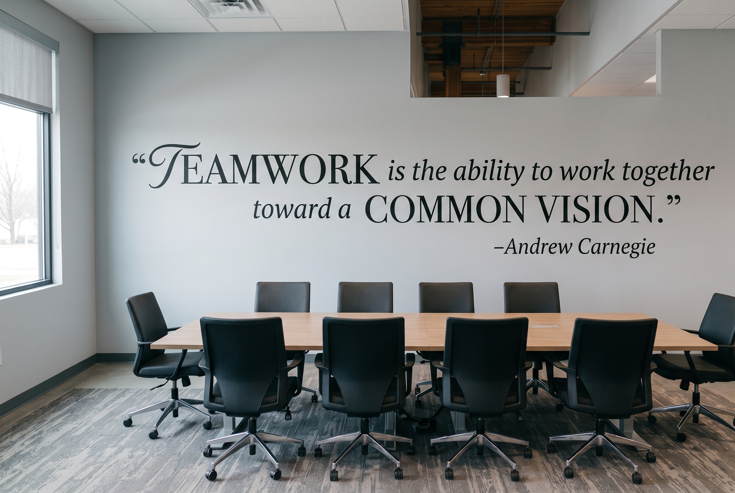
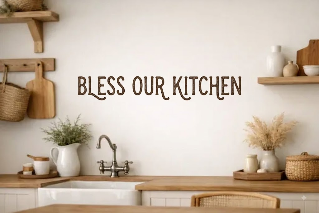
Custom vinyl wall decals are a practical fit for schools because they can be sized for the available wall space, designed around school branding, and installed without paint or lengthy construction. A matte finish helps the lettering look clean on the wall while reducing glare from cafeteria lighting. When a layout changes, removable vinyl also gives schools more flexibility than permanent painted graphics.
For schools that need a logo, specific wording, or a coordinated set of directional messages, a custom design approach helps ensure the colors, scale, and instructions work together. That is often more effective than piecing together unrelated signs over time.
Review the Plan During a Real Lunch Period
A cafeteria wayfinding plan looks different on paper than it does with hundreds of students moving through the space. Before finalizing placement, observe a lunch period. Watch where students stop, where lines cross, and which questions staff answer repeatedly.
After new signs are installed, listen to cafeteria staff for the first few weeks. If students still cluster around a station or miss a direction, the issue may be wording, size, or location rather than student behavior. Small adjustments can have a meaningful effect on daily flow.
The strongest cafeteria signs are the ones students barely have to think about. They quietly guide the next step, support a smoother meal period, and leave staff with more time for the students in front of them. For a coordinated set of custom, removable cafeteria decals, The Simple Stencil can help turn your school’s traffic patterns into clear, polished wall messaging.
Ready to upgrade your school cafeteria with custom signage? Get your personalized quote today—just share the details below and let our experts handle the rest:
1. Signage List: Tell us which signs or wall decals you need.
2. Style & Dimensions: Share your color schemes, style ideas, and size requirements.
3. School Branding: Upload your school logo or graphics.
4. Cafeteria Photos (Optional): Send pictures of your space. We’ll review your layout and advise on the best locations, sizes, and designs to create a cohesive, professional look.
Ready to bring your school’s vision to life? Don’t let empty walls dull your cafeteria’s potential. Contact our team today or upload your project details to get started on your custom quote. Let’s build a vibrant, welcoming dining space your students and staff will love!





Leave A Comment
You must be logged in to post a comment.