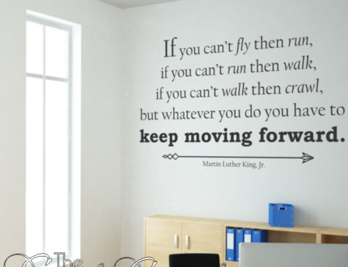
Where you put your stencils is almost more important than what they say.
The inspirational sayings you put on your library walls are selected with care and with reason. You are the educational expert, and you know what motivates the children in your care. What you may not know, and what you may struggle with, is where to put these messages; how to display them. Location can make or break their effectiveness; perhaps a few interior design guidelines will help.
Contrast is the Key
Here’s the most important guideline for displaying anything you want people to notice: “ Your eye goes to the area of greatest contrast first.” This typically applies to the focal point of a room but applies to anything you wish assign importance to.
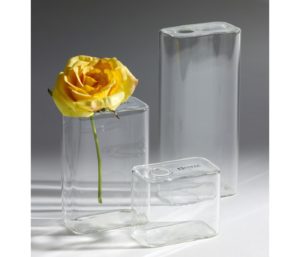 Picture this: Three vases on a window sill —they are similar in material, color, and style — but one holds a flower. You will notice the one with the flower first.
Or this: A beige-walled living room. Wood floors, brown leather sofa, soft, earth-toned side chairs. On each chair is a vibrant orange floral print pillow. The pillows win the “Look at Me!!, Look at Me!!” hollering contest.
A gallery wall: Full of pictures. Just full. Except off to the right is a big blank space. Where does your eye go first? Yes, the big blank space.
When placing pictures in a home, (or an art gallery), the horizontal center of the image, or most important image in a grouping, is often positioned about 59 inches from the floor which is the average “eye-level” for adults. The eye-level for children is obviously less.
Contrasting colors create the most visual noise and are noticed first over colors side-by-side on the color wheel. For example, red and green are louder than green and blue.
Three Fool-proof Tips
So, how can you use this information when placing inspirational stencils in a library?
- Create blank space and use it to highlight ONE, easy-to-read, vibrant-colored stencil. Leave lots of blank space around it — enough that the stencil stays the focal point. Choose a subject matter which is easily identifiable from the script, or colors, or logo.
- Remember that reading is more difficult if the font is all capitals, and that serif fonts are more difficult for most people to read.
- Less is more; use one large, eye-catching stencil rather than several small ones.
Make sure that the stencil is large enough to be read from a normal viewing distance. For example, if the words relate directly to a section of the library, make sure the font is large enough that it can help draw traffic to that area from across the viewing area.

Browse a collection of creative library wall art designs here or contact us for a free custom design sketch and quote at designs@thesimplestencil.com


Leave A Comment
You must be logged in to post a comment.